Sci-fi UI Pixel Art
A downloadable asset pack
The Trek-like computer user interface (UI) is called LCARS -- Library Computer Access/Retrieval System. It is a tiled, rather than windowed, GUI that takes obvious inspiration from the DOS console (all caps font on black background) and a database record interface of some form, probably imaginary. It uses high-saturation colors from the whole rainbow EXCEPT green and red (I think) -- although the entire thing turns red during red alert.
My tileset is sticking mostly to a paler blue, but with other colors, and even gradients and textures, as possible experiments. It is licensed CC0.
The basic set of simple UI components is in the PNG file called blue_lcars_24x24. The tiles need to be as small as I dare (24x24 pixels) based on my initial experiments. I added a 1px offset to the tileset.
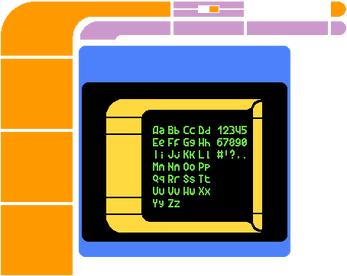
A bigger tileset is in the works with more options (and no tile offset -- it is designed to be much easier to use). You can see an example of it on the cover image. I envision making enough tiles and widgets that a UI theme can be made that is a merger of Material Design and some desktop UI with more sci-fi aesthetics.
The font is closely based on a CC0 font by Buch on Opengameart.org
| Status | In development |
| Category | Assets |
| Rating | Rated 5.0 out of 5 stars (1 total ratings) |
| Author | Zed Hanok |
| Tags | 2D, cc0, Graphical User Interface (GUI), lcars, Pixel Art, Sci-fi, Tileset, User Interface (UI) |
Download
Install instructions
These tiles are 24px by 24px and the basic tileset (blue_lcars_24x24.png) has a 1px offset between the tiles to more easily see the individual tiles. The bigger PNGs have no offset and some duplicate tiles so it can showcase examples of how it fits together. Licensed CC0.
Development log
- To Become a Rainmeter Skin...Aug 09, 2020
- Update and Overhaul HappeningMay 04, 2020
- A bunch of stuff coming soon...May 02, 2020
- Large Update to AssetsApr 10, 2020
- Trouble and IdeasApr 08, 2020
- More Assets AddedApr 05, 2020
- Guiding Principles and Vision for the Future AssetsApr 04, 2020
- Modifications in the WorksMar 30, 2020

Comments
Log in with itch.io to leave a comment.
The devlog will have some links to useful resources. Also, some good fonts can be had for free from League of Moveable Type!
My mock-ups are getting overly complicated because I didn’t like the early version of graphics. I hope to make a Trek-like SHMUP or asteroids clone in a week or two.
I’ve got some new stuff in the works coming! They are “treklike” mock-ups – similar but not identical to Trek, so the assets can more easily be used in any sci-fi project (including Trek stuff, or commercial sci-fi projects of other kinds).
I’ve been really sick, though, so it’s going slower than I’d like. (I’m always sick, not Covid-19. I had Lyme for decades untreated, so I’m lucky to be doing as well as I am.)
This is great stuff! Love seeing UI assets! Are those colored squares there for potential color customization?
Yeah, those are some color customization I’m gonna play with. I think I’m also going to try to imitate the metallic texture of LCARS System47 screensaver – eventually. Right now I’m trying to make some more stuff for full-screen mockups, when I have time.
(Sprites for space ships on a scope, maybe personnel indicators, stuff like that I’m experimenting with.)
A solid start, will you be making a matching font or other amenities?
I intend to. I’m thinking of a full screen mockup with all kinds of stuff, maybe two screens to show two different color schemes (TNG Season 1 and the later, high-color theme).